Friday, June 29, 2012

The World's Growing Human Biomass

To close out the month and the first half of 2012, I thought that I'd close on a bit of a "lighter" note, particularly as we are entering the summer bathing suit season.  You'll see, as you read on, my very weak use of a pun in the opening sentence.

A research article entitled "The weight of nations: and estimation of adult human biomass" estimates the world's human biomass, how it is distributed across the globe and how much of the human biomass is due to obesity.  For those of you without a science background, biomass is defined as "the total mass of organisms in a given area or volume".  In this case, the authors of the study looked at the total mass (weight) of human organisms on earth.

For each country, the authors of the research paper used data on body mass index (BMI) and height distribution from the World Health Organization to calculate the average adult body mass which was then multiplied by the population (using 2005 population data) to get the total human biomass.  Because height and BMI data was not available for some countries, approximately 40.7 million adults were excluded from the study, a rather insignificant omission considering the world’s total population.  The authors also estimated the percentage of the population that is both overweight and obese and how much of the global biomass results from obesity.

Scientists know that humans require more energy to move a heavier body.  As well, when humans are at rest, energy requirements increase with body mass due to an increase in metabolic activity.  The authors note that there is an increase in global demand for food arising from an increase in body mass and that this contributes to higher food prices.

Now, let's look at the results.  In 2005, the total human biomass was approximately 287 million tonnes with average global body mass of 62 kilograms or 137 pounds.  Biomass due to overweight humans (5 percent of the population) was 15 million tonnes, the equivalent of 242 million people of average body mass.  Biomass due to obesity (1.2 percent of the population) was 3.5 million tonnes, the equivalent of 56 million people of average body mass.

Which area of the world had the highest body mass?  North Americans have an average body mass of 80.7 kg (178 pounds) with more than 70 percent of the population being overweight.  It only takes 12 adult North Americans to make up one tonne of human biomass.  North America has 6 percent of the world's population but 34 percent of the world's total biomass due to obesity!

Which area of the world had the lowest body mass?  Asians have an average body mass of 57.7 kg (127 pounds).  It takes 17 adult Asians to make up one tonne of human biomass.  Asia has 61 percent of the world's population by only 13 percent of the world's human biomass due to obesity.

Here is an interesting table showing the heaviest and lightest 10 nations:


Japan has an average BMI of 22.9.  If all nations in the world shared this BMI, the total human biomass would fall by 14.6 million tonnes or 5 percent of the total.  As a result, the biomass due to obesity would fall by 93 percent.   The United States has an average BMI of 28.7.  If all the nations in the world shared this same BMI, the total human biomass would rise by 58 million tonnes, a 20 percent increase.  As a result, the world's biomass due to obesity would increase an astonishing 434 percent and would result in an increase in energy requirement (i.e. food) equivalent to that consumed by 473 million adults.

Why is any of this relevant?   The authors suggest that increasing human biomass will have important implications for global resource and food requirements and will ultimately impact the world's ecology since food production goes hand-in-hand with carbon emissions.  As well, the authors note that since the world's average BMI is rising, the impact on the world's food resources could become critical in the future.

Thursday, June 28, 2012

The Pain of Austerity

If you've been awake over the past few months, you're aware that the world, particularly Europe, is suffering from a rather uncomfortable debt situation.  As I posted here, it is going to be an uphill battle for the world's advanced economies to reduce their rapidly growing debt levels; the Bank for International Settlements (BIS) recently stated that to bring government debt-to-GDP ratios back to Great Recession levels, it will take 20 consecutive years of surpluses exceeding 2 percent of GDP!  The odds of that - slim at best and most likely nil.

Earlier this year, the Congressional Budget Office released an interesting paper entitled "Sovereign Debt in Advanced Economies: Overview and Issues for Congress" by Rebecca Nelson.  In this paper, Ms. Nelson notes that the high levels of debt among the world's advanced economies are a new global concern that has erupted out of the 2008 - 2009 global financial crisis.  As we have seen, governments are embarking on fiscal austerity programs in a last ditch effort to get their books in order, however, some economists note that these measures may well undermine the very weak global economic recovery, now into its third year.  As one would expect from a non-science science, other economists argue that current government austerity measures do not go far enough to rein in burgeoning debt loads, particularly as most developed nations will be experiencing top-heavy population trees.

How does all of this fit into the mandate of Congress?  There are two factors to consider:

1.) Is it likely that the U.S. is headed for a Eurozone-type debt crisis?  Current bond interest rates would suggest that this is unlikely, however, looking back five years, one would have never suspected that the PIIGS sovereign bonds would be suffering from interest rates in excess of 6 percent.

2.) What impact will Europe's debt crisis have on the United States economy?  Slower growth in advancing economies could impact trade between America and its main trading partners.  As well, in September 2011, direct U.S. bank exposure to Greece, Ireland and Portugal reached $55 billion, leaving their balance sheets somewhat vulnerable.

Let's start by looking at several graphs from the report.  The first graph shows the changes in the gross public debt levels for the G-8 nations since the end of World War II:


The sovereign debt level for the G-7 rose from 84 percent of GDP in 2006 to a forecasted 119 percent of GDP in 2011, a 42 percent increase in just five years.

The second graph shows the gross government debt for both advanced economies and developing economies between the year 2000 and 2010, projected forward to 2016:


Sovereign debt levels for the G-7 economies rose from 84 percent of GDP prior to the Great Recession to 114 percent of GDP in 2010 and are projected to rise to 127 percent of GDP by 2016, an increase of 51 percent over 10 years.  In sharp contrast, debt levels in developing economies fell from 52 percent of GDP in 2002 to 39 percent of GDP in 2010 and are projected to fall even further to 29 percent of GDP by 2016, a decrease of 44 percent over 14 years.

Here is a graph showing the variation of gross public debt among advanced economies in 2011:


Here is a graph showing the variation of net public debt among advanced economies in 2011:


Please keep in mind that the difference between gross and net public debt statistics refer to that particular government's financial assets which are subtracted from gross public debt to give us net public debt.  In the case of Japan, its gross public debt in 2010 was 220 percent of GDP but, thanks to large assets, its net public debt is "only" 117 percent of GDP.  In sharp contrast, Greece's gross government debt and net government debt were both 143 percent of GDP in 2010 since the Greek government has no assets.

What kind of measures would be required to get this debt problem straightened out?  Here is a graph showing the fiscal cuts that would be necessary to reduce debt levels to 60 percent of GDP by 2030 for the world's advanced economies:


To help you understand the preceding graph, let's look at the United States.  Please note that a primary budget surplus is the budget balance excluding interest owing on the debt.  The U.S. would have to achieve a primary surplus of 5.1 percent of GDP by 2020 and sustain it through to 2030 to achieve the 60 percent debt-to-GDP goal.  In 2010, the primary deficit was 8.9 percent of GDP.  This means that the total fiscal cuts necessary for the United States to achieve the 60 percent debt-to-GDP goal would be equal to 11.3 percent of GDP relative to the 2010 primary balance (deficit) or just under $1.7 trillion, the third highest among advanced economies after Japan and Ireland and just ahead of Greece.  Now that's painful austerity!

On average, the world's advanced economies would have to reach a primary budget surplus of 3.8 percent of GDP by 2020 and sustain it through to 2030 to achieve the average 60 percent ratio.  Currently, the advanced economies are running a primary budget deficit of 4.8 percent of GDP meaning that, to reach the target of 3.8 percent surplus by 2020, the average fiscal adjustment will have to be 7.8 percent of GDP.

With this data in mind, why does the United States seem exempt from the wrath of the world’s debt market?  The saving grace that is currently preventing the United States from becoming the next Greece, Portugal or Ireland is the fact that its currency is the world's choice for its reserves.  As well, generally strong economic growth has kept the debt wolves at bay.  That said, here is a graph showing how quickly Spain saw the yield on its 10 year bond rise from under 4 percent to just over 7 percent:


Basically, we cannot say that the interest rates on U.S. federal debt will never rise rapidly.  At some point, the world's bond traders may simply lose confidence in the ability of the American government to continuously grow its debt, particularly if there is a repeat performance from Congress over the debt ceiling.

To summarize, the solution to the world's sovereign debt issues look rather daunting.  As we've seen in Europe, the imposition of what have been until this point relatively modest austerity measures have resulted in both social upheaval and the tossing out of incumbent governments.  The world's economy is already showing signs of slipping back into negative growth even with the very modest measures taken.  There is one thing that I think we can count on; the next recession will be different than the recession that the world experienced in 2008 - 2009.  Since sovereign debt levels were not at the sky-high levels that we are seeing today prior to the Great Recession, we are entering uncharted fiscal territory.  The next global downturn could well be "The Big One".

Tuesday, June 26, 2012

The Vicious Cycle Hindering the Global Economic Recovery

The Bank for International Settlements or BIS has recently released its 82nd annual report for the year 2011.  As you may recall, BIS is an intergovernmental organization of the world's central banks located in Basel, Switzerland; in other words, it's the central bank for the world's central banks.  Scattered throughout this rather large document are a few gems that I would like to include in this posting since, surprisingly, the mainstream media pays very, very little attention to what BIS has to say.

BIS opens by noting that the global economy is still struggling with the legacies of the financial crisis and that "vicious cycles are hindering the transition for both the advanced and emerging market economies".  Not unexpectedly, the world is experiencing a two-speed recovery; rather unexpectedly, this time things are different because it is the world's "advanced" economies that are suffering from lagging economic growth while emerging markets are seeing their share of the world's economic growth rising as shown on these graphs:


The economies that were at the centre of the 2008 - 2009 financial crisis are still experiencing that splitting hangover headache from the collapse of their respective real estate booms and their excessive household debt levels.  BIS states that household debt levels remain close to 100 percent of GDP in several countries including Ireland, Spain and the United Kingdom.  Accompanying high household debt levels is the problem of highly leveraged governments and financial sectors that are very slow to improve the problems on their balance sheets, particularly in the world's developed economies.

This has left the world's central bank system stuck between a rock and a very hard place.  Over the year that was 2011, central banks increased their purchases of government bonds in an effort to shove stubborn interest rates down right along the yield curve as a last ditch effort to prod the world's reluctant economy back to life.  At this point in time, the total assets of the world's central banks stand at $18 trillion (and growing), a level that is roughly 30 percent of global GDP.  As I have posted before, here are a handful of graphs showing how central bank balance sheets have grown and the assets that they hold:


BIS points the fickle finger of fate at government inaction for backing the world's central banks into a corner as average government deficits have risen from 1.5 percent of GDP in 2007 to 6.5 percent in 2011 and debt has risen from 75 percent of GDP to more than 110 percent in the same timeframe.  To bring government fiscal situations back to pre-crisis levels, it will take 20 consecutive years of surpluses exceeding 2 percent of GDP just to bring the debt-to-GDP levels back to pre-Great Recession levels.  To put it mildly, that is about as likely as pigs learning how to fly between now and 2032.  Unfortunately, as I have said before, central banks have been their own worst enemies in some ways; their ultra-cheap credit has led the ruling class around the world to believe that they can continue to accrue debt at breakneck speed with no repercussion.  Here are two graphs showing the sharp contrast between interest rates for the world's advanced and emerging market economies showing how cheap credit is for what turns out to be the world’s most indebted economies:


Here's what BIS has to say about where the fault lies (all bold is mine):

"The extraordinary persistence of loose monetary policy is largely the result of insufficient action by governments in addressing structural problems. Simply put: central banks are being cornered into prolonging monetary stimulus as governments drag their feet and adjustment is delayed. As we discuss in Chapter IV, any positive effects of such central bank efforts may be shrinking, whereas the negative side effects may be growing. Both conventionally and unconventionally accommodative monetary policies are palliatives and have their limits....In fact, near zero policy rates, combined with abundant and nearly unconditional liquidity support, weaken incentives for the private sector to repair balance sheets and for fiscal authorities to limit their borrowing requirements. They distort the financial system and in turn place added burdens on supervisors.

With nominal interest rates staying as low as they can go and central bank balance sheets continuing to expand, risks are surely building up. To a large extent they are the risks of unintended consequences, and they must be anticipated and managed. These consequences could include the wasteful support of effectively insolvent borrowers and banks – a phenomenon that haunted Japan in the 1990s – and artificially inflated asset prices that generate risks to financial stability down the road. One message of the crisis was that central banks could do much to avert a collapse. An even more important lesson is that underlying structural problems must be corrected during the recovery or we risk creating conditions that will lead rapidly to the next crisis.

In addition, central banks face the risk that, once the time comes to tighten monetary policy, the sheer size and scale of their unconventional measures will prevent a timely exit from monetary stimulus, thereby jeopardising price stability (i.e. inflation). The result would be a decisive loss of central bank credibility and possibly even independence."

Not that a loss of central bank credibility hasn't already happened!

When talking about "wasteful support of effectively insolvent...banks" perhaps BIS need look no further than the bailout of the banking systems of Spain, Ireland, Greece, Italy and many other nations.

Here is a graphic from the report showing the "vicious cycle" that the world's central banks are trapped in today:


Lest those of us who live on the west side of the Atlantic get cocky, in closing, here is an interesting comment from the annual report:

"Over the past year, much of the world has focused on Europe, where sovereign debt crises have been erupting at an alarming rate. But, as recently underscored by credit downgrades of the United States and Japan and rating agency warnings on the United Kingdom, underlying long-term fiscal imbalances extend far beyond the euro area."

BIS' annual report for 2011 paints a rather grim but quite realistic picture of what lies ahead for the global economy.  What is particularly concerning is that the outlook is so grim three years into the "recovery".  Unfortunately, it likely means that the next global economic downturn will be even more painful than the Great Recession since, in many ways, the economy never recovered from the last crisis.

Sunday, June 24, 2012

Egypt's Petroleum Industry - A Point of Vulnerability

Updated August 2013

With turmoil in Egypt once again making headlines, I thought that it was time to take a brief look at one of Egypt's main sources of foreign exchange, its oil industry.  Since this is an important part of Egypt's economy, it could also be the focus of actions by various parties in any civil uprising.

Egypt, while not benefitting from the massive reserves of oil that its Middle East neighbours possess, has a remarkably old industry.  Oil was first discovered in Egypt in 1869 and production began in 1910.  A joint venture between BP and Shell called Anglo-Egyptian Oil explored for and produced oil from 1910 until 1964 when the Egyptian government nationalized its reserves.  Egyptian General Petroleum Corporation was founded by the Egyptian government in 1962 and is resposible for all sectors in the Egyptian petroleum industry, holding the sole rights to import and export all petroleum products.  As well, EGPC maintains a joint venture will all other foreign parties investing in Egypt's oil industry.  Egypt's government also created EGAS or Egyptian Natural Gas Holding Company in 2001 to manage foreign investment in exploration for natural gas and the use of LNG infrastructure.  One of EGAS's mandates is to prove additional natural gas reserves through intensive exploration.

Until 2009, Egypt actually exported much of its oil, however, that has changed as domestic energy demand has increased.  Here is a graph showing how much oil Egypt has produced in BOPD for the last 30 years ranking 26th place in the world:


Here is a graph showing how much oil Egypt has consumed in BOPD for the last 30 years:


Here is a graph showing how much oil Egypt has imported and exported over the last 30 years:


Lastly, here is a graph showing Egypt's proved reserves of oil in billions of barrels:


Notice how the proved reserves dropped markedly in the mid-1990s and have never really recovered as Egypt's production ramped up along with its consumption as shown above.

Egypt's energy growth story will be on the natural gas side of the business as shown in the following graphs.  Here is a graph showing Egypt's natural gas production pattern over the last 29 years:


Surprisingly, Egypt is actually the world's 12th largest natural gas producer and the growth in its production profile is not showing any signs of slowing down.   

Here is a graph showing Egypt's domestic natural gas consumption pattern over the last 29 years:


Here is a graph showing Egypt's natural gas imports and exports since 1999 showing how natural gas exports are growing:


Egypt exports most of its natural gas to Lebanon, Jordan and Syria through the Arab Gas Pipeline and to Israel through the Arish-Ashkelon pipeline addition.  As well, Egypt is the world's 13th largest exporter of liquified natural gas (LNG).  Egypt exports LNG to the United States (160 BCF in 2009), representing 35% of U.S. imports of LNG and 35% of Egypt's LNG exports.  Other recipients of Egypt's LNG are Canada, France, Spain, Mexico and Asia.  Egypt's largest LNG partnership is partially foreign-sponsored by Petronas and Gaz de France and construction of the LNG facilities has brought in $2 billion worth of investment into Egypt's economy.

Lastly, here is a graph showing Egypt's proven natural gas reserves and how they have grown over the past three decades:


Egypt's natural gas reserves now rank 19th in the world.  Most of Egypt's natural gas reserves are found in the  Natural gas now provides 49 percent of Egypt's total energy consumption, more than oil which provides 45 percent.  Natural gas is used to produce 70 percent of the country's electricity generation needs with the remainder being supplied by hydro-electricity.

One of the most critical aspects of Egypt's oil and gas industry is its control of both the Suez Canal and the Sumed Pipeline.  Total petroleum transit volume through the Sues Canal reached 2 million BOPD or five percent of all seaborne oil transports in 2010.  The Sumed Pipeline, an alternative to the Suez Canal, has a capacity of 2.3 million BOPD and flows across Egypt's Western Desert from the Red Sea to the Mediterranean coast.  If political issues were to result in closure of both of these transportation bottlenecks, oil from the Middle East would have to travel an additional 6000 kilometres around the southern tip of Africa to reach markets in Europe and the Americas.  This would prove problematic although not unsolvable.

Only time will tell how quickly and quietly Egypt solves its ongoing political crisis.  It is interesting to see that Egypt's oil and natural gas industry is a major part of its foreign trade; an aspect that could prove to be a point of vulnerability for Egypt's next government if civil strife erupts.

Thursday, June 21, 2012

"JOLT"ing America Back to Work

Recent data releases regarding the state of the job market in the United States have been sending mixed messages about the economy.  The headline U-3 jobless number seems to be intransigently set above 8 percent and the weekly jobless claims numbers seem to be bobbing around the 370,000 to 380,000 range as shown on this graph from FRED:


While this is well off the highs seen in 2009, it most certainly doesn't look that healthy when we compare it to the levels seen during past recoveries, particularly the recovery between 2001 and 2008 when initial claims dropped to the 300,000 to 320,000 range as shown on this longer term graph:


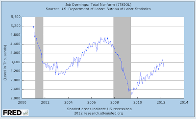
Whatever could be the problem?  Perhaps the answer lies in the JOLTS data released by the Bureau of Labor Statistics which shows us the number of job openings available to jobless Americans.  Here is a graph showing the total number of non-farm jobless openings from 2001 to the present:


You'll notice that the number of job openings plummeted from a peak of 4.69 million in June of 2007 to a low of 2.186 million in July of 2009 during the depths of the Great Contraction, a drop of 53.3 percent.  Since then, the number of job openings has slowly but surely increased, however, it is still well below the levels experienced during the period between March 2006 and September 2007 when it was above 4.4 million every month except two.  In fact, the April 2012 level of 3.416 million jobs is reminiscent of the levels seen back in 2004 and is still between 20 and 25 percent lower than the average just prior to the Great Recession.  It is also interesting to note that the current level is still  well below the levels seen at the beginning of the new millennium where, during the recession in 2000 - 2001, job openings remained above 3.5 million every month.  

As well, in recent months, the number of job openings seems to have stalled around the level of 3.5 million which was achieved back in September 2011.  What is even more concerning is the 9 percent month-over-month drop from 3.741 million in March 2012 to April's 3.416 million level.

Where are/aren't these job openings?

Here is a graph showing government job openings:


Nope, no particular improvement in the government jobs' picture.

How about construction?


Very few job openings in that sector too, particularly when one considers that during peak periods, between 240,000 and 260,000 job openings existed for construction workers, up significantly from the current level of 80,000.

Lastly, how about manufacturing?


While things have picked up significantly since the bottomless pit of the Great Recession, openings in April 2012 dropped to 246,000, down 20 percent from the previous month where openings hit a post-recession high of 308,000.  Keep in mind that we must keep this data in perspective; looking back to the early part of the millennium, manufacturing job openings exceeded 440,000 when this data was first recorded.

Actually, this graph may help explain some of the issues facing those who manufacture things for a career:


Apparently, America just doesn't make things any more, either that, or it takes a whole lot less Americans to make what we actually do consume.

Apparently, it would appear that the jobs simply are not there, explaining why unemployment seems intransigent and why some Americans just don't feel like the Great Recession ever ended.  Despite the endless Bernanke Twist'n'Ease, the employment sector of the economy just isn't firing on all cylinders.  

Tuesday, June 19, 2012

Europe Bond Yields - The Great Divide

Updated July 20, 2012


As someone who follows the world's bond market relatively closely, over recent months, I have noticed an interesting trend in European bond yields and have seen yields that I would never have thought possible.  I'm going to let several charts do my writing for me, noting that all charts follow the changes in yield over the past 3 years.

Here is the chart showing the yield for 2 year Portuguese bonds:


Here is the chart showing the yield for 2 year Irish bonds:


Here is the chart showing the yield for 2 year Italian bonds:


Here is the chart showing the yield profile for 2 year Greek bonds:


Lastly, here is the chart showing the yield for 2 year Spanish bonds:


Now, let's look at the contrasting yields on several non-PIIGS European bonds:

Here is the chart showing the yield profile for 2 year German bonds which actually went negative in late May/early June and where they have been for two weeks:


Here is the chart showing the yield profile for 2 year Swiss bonds which are currently well into negative territory where they have been for weeks:


Here is the chart showing the yield profile for 2 year Danish bonds which are also in negative yield territory:


Lastly, here is the chart showing the yield profile for 2 year Finish bonds which are sitting at a tiny fraction of a percentage above zero:


If we exclude Ireland, there seems to be a very strong north-south split.  It's also interesting to see investors' desperate "flight to security"; their willingness to pay to have a nation hold onto their funds for two years and get less back in the end is nothing short of astonishing!

Here is a chart showing the debt, debt-to-GDP profiles for the aforementioned countries current to the end of 2011 according to Eurostat (except Switzerland as linked here):


Germany is definitely getting a pass on its high debt level because of its strong economy, however, that could change if interest rates rise and their debt continues to climb as they are forced to bailout their neighbours.  

Since all European nations are sharing a common currency, technically, they should all be sharing similar interest rates, a situation that was the case until the beginning of the Great Recession as shown here:


Even though bond interest rates have moderated for Spain, Italy and Greece in recent days, there is still a great deal of difference between the debt transgressors and those nations that are perceived to be safe havens.  Now that you've looked at all of these charts, what do you the odds are that Europe will survive in its current incarnation?  My suspicion is that the union of the unequals is doomed.